Display FAQ: Engaging Your Audience
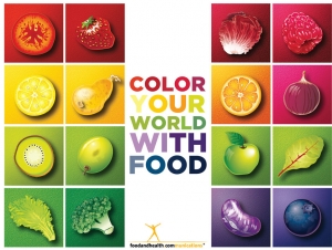
Let's talk about nutrition education displays.We all know that people learn in a ton of different ways. Sometimes offering a range of presentation styles will mean the difference between a client reading about an important lesson and that same client actually internalizing it.Of course, presenting key health messages in a variety of ways is easier said than done. And don't get me started on health fair booths and popup presentations! These days, you have to be a marvel of creativity to get the messages from your materials to your audiences' brains.Or do you?As always, I want to make your job easier. Today I want to focus on ways to engage visual learners with great displays.Let's take a look at the answers to some common display questions...Question #1: I want to communicate key health messages in the cafeteria. Where do I start?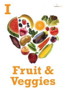 Honestly, we've found that the most effective way to help people internalize health messages while in the cafeteria is by hanging up simple and colorful posters. If you choose attractive ones, you'll be improving the ambiance of the cafeteria, adding some great pops of color, and offering health guidance all at the same time.This is not a space for complex messages -- people don't often spend a lot of time staring at displays or approaching and analyzing a bulletin board. At least, they don't do that in the cafeteria. That's why posters are such a good fit. Stick with options that are colorful and low on words. When you keep things simple, your audience will be able to focus on the big picture.Want to try it for yourself? Check out the following posters for our recommendations about where to get started with cafeteria decoration/education...
- I Heart Fruits and Veggies
- Healthful Choices 1-2-3
- High Five for Fiber
- Scale Down Your Portions
- Real Food Grows
- Change It Up: Eat a Healthful Diet
- Colors of Health: Variety is Key
Based on customer feedback, we've noticed that the posters that promote healthful food choices and regular exercise have the biggest impact on people who are observing cafeteria displays.Question #2: How do I make my health fair booth stand out?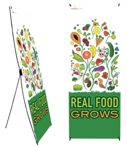 Health fairs are awesome! If you want to stand out, however, you need to move beyond the colorful background poster with a tray full of handouts approach and add some visuals that will make your booth unique.One thing that a bunch of our clients have used with great effect is a set of customized balloons. Custom balloons are unique, bright, and draw people in for a closer look. To make these tools communicate nutrition and health messages at the same time that they're drawing a crowd, we designed our own fruit and vegetable balloons, which are now available in the Nutrition Education Store.Also, if your health fair allows it, people are always crowding around booths with food. Free samples of healthful snacks are a great way to demonstrate that eating healthfully doesn't have to be boring, and you can do it while increasing traffic to your booth. What's not to love?Oh and banners have been one of our highest-rated health fair tools. Using a big, colorful banner adds zing to your booth, helps clarify your main message, and can draw people in. For example, the 3 Stepping Stones to Health banner offers a simple, clear message (here's how you can improve your health), and a bright, uplifting scene. At the same time, there is clearly detail on how to take each step, but to find out what it is, you audience must approach the booth. If you want to feature a banner at the next health fair, check out the selection of banners at the Nutrition Education Store or use them as inspiration to create your own!Of course, a group of people engaged in an activity also draws more people to come over and see what the first group is doing. We've talked with dietitians who have put together guessing games (how many calories are in this jar of jellybeans?), trivia challenges, and Jeopardy-style quizzes at regular intervals at their health fair booths, and these activities have always upped the foot traffic to their booths. People love activities like this, especially at health fairs, which more typically feature lecture-style presentations. Mix things up with a fun game or trivia wheel -- people will be flocking over to see what all the fuss is about.Oh and we can't abandon the answer to this question without giving a shout out to our wellness fair kits. With a wide variety of resources available in every kit, these handy nutrition education tools take all the guesswork out of planning your booth. Take a look at all the options available in the Nutrition Education Store, and let me know if you can't find what you need.Question #3: I'm putting together a bulletin board -- how do I make it attractive and balanced?
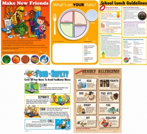
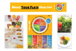 It's easy for bulletin boards to get too cluttered. To avoid that, what you want to do is find a mix of large, simple, and clean images and combine them with smaller pieces that offer more detail about your topic. Too much of one or the other can throw a board out of whack and make it hard to read, and nobody wants that.The most effective bulletin boards balance a few different ways to get their messages across. A simple message, featured with clear and clean art, will draw in your viewer. Then, the more detailed and smaller elements can offer specifics about the topic. Mixing the two in a way that is balanced and visually-appealing is the key.Speaking of balance, when you create your board, you'll also want to balance text with images. Too much text turns a bulletin board into one giant handout, and not a very engaging handout at that. On the other hand, a bulletin board that only uses images can be open to misinterpretation. What do you want to communicate with text? What do you want to use pictures for?Oh, and one element of bulletin boards that has gotten a lot of great feedback from our customers is a tear-off or "take with you" section of the board. You could pin up a layer of recipe cards that people can peel off and take home, or you could include a flyer for an event or sport with a tear-off "more information" section. Some people have even had great luck mounting a section of their nutrition tearpads. People have fun taking home a souvenir from a bulletin board, and what better way is there to make sure a message stays with your audience than by having that message actually accompany them home?Check out the selection of posters, handouts, tearpads, and food art that can bring your bulletin board from good to great. Each poster comes with a display guide that features bulletin board tips, and free handouts often accompany the poster as well. Oh, and don't miss the free clipart that you can use to add more pep to your board.Of course, we've gotten tons of customer feedback over the years and have used it to put together the most useful visual tools for bulletin boards. Take the guesswork out of arranging your display with a bulletin board kit! Some of my favorites include...
- Calcium Bulletin Board Kit
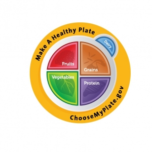
- MyPlate Bulletin Board Kit
- Healthful Eating Quiz Bulletin Board Kit
- 8 Bulletin Board Kit Package
So, that's a look at a few different ways to give your nutrition education displays some oomph! If you're looking for other resources, check out some of the display tools that have been getting the best reviews...